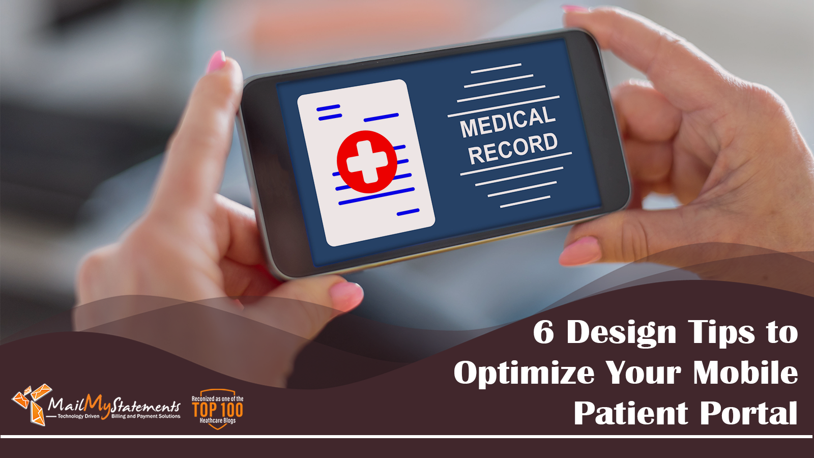
6 Design Tips to Optimize Your Mobile Patient Portal
The purpose of offering an online patient portal is to empower patients to make faster, more consistent payments on their medical bills. Patient portals are a convenient tool for the patient, you, and your healthcare organization. However, when the mobile version of that portal doesn’t look or function the same as the desktop version, it becomes difficult for your customers to use the app and make a payment. Any revenue you would have collected when your clients opened their phone to make a payment on the go can be lost if your portal isn’t clean, efficient, and functional.
So how can healthcare organizations and digital designers set up their mobile portals to keep customers engaged and encourage quick payments?
6 Design Tips for Your Mobile Patient Portal
1. Modify formatting to fit a smartphone
When you originally design your online patient portal for a desktop version, the formatting will automatically look clunky on the mobile version. The first thing you’ll need to do when altering your portal to a mobile layout is come through your site and check for formatting errors.
Keep in mind that your desktop version and your mobile version shouldn’t look exactly the same. It’s completely acceptable to have your mobile version be a reduced, simplified version of your desktop portal. Think about your favorite apps and how they’re laid out and consider implementing some of those design aspects into your mobile patient portal.
2. Minimize clicking by automating processes
Have you ever started to take a customer feedback survey but then quit when you realized the survey was 50 questions long? Now, apply that experience to a mobile patient portal. Just like the desktop version, customers will get annoyed if they have to spend too much time clicking, manually filling out forms, and scrolling up and down a long web page.
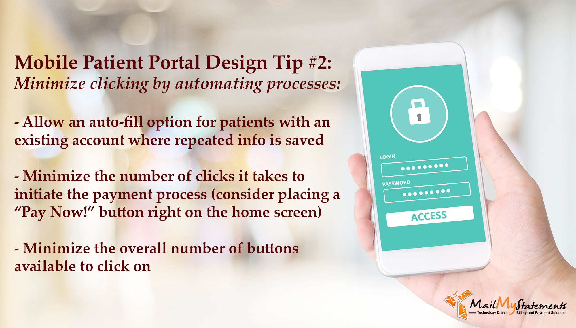
To avoid this issue, make sure you’re automating processes whenever possible. This could look like:
- Allowing an auto-fill option for patients with an existing account where their name, address, and billing information is saved
- Minimizing the number of clicks it takes to initiate the payment process (consider placing a “Pay Now!” button right on the home screen)
- Minimizing the overall number of buttons available to click on
3. Consider implementing a scanner tool
When saving credit card information isn’t an option, the next fastest method for filling out those form fields is to offer a scanner option to upload card information. With a scanner, the mobile portal will use a smartphone’s camera to upload the card number and expiration date into the form fields.
4. Create a simple, unified format and color scheme
Because smartphones are smaller than a laptop, much less information should be presented on screen for mobile patient portals. Busy, cluttered, and confusing pages with multiple calls to action will distract users from what they’re ultimately trying to do: pay their medical bill. When presented in a mobile format, an ideal patient portal will have bigger buttons, larger text, less variation in color, and a simpler overall layout.
5. Avoid using images

This is a tip that applies to desktop versions, too. Avoiding images in web design will help people with screen readers understand the content on the page. Unless you have an incredibly detailed description in the “alt text” section on the back end of your site, people with vision issues won’t be able to easily comprehend your message, especially if you have a .jpg or .png file that has important text on it, such as the breakdown of a bill or an important notification. When image use is unavoidable, make sure the alt tag accurately describes the image’s content.
For more tips on how to make your online patient portal more accessible, click here.
6. Maximize the potential of your buttons
Buttons are the driving force of your patient payment portal. They tell users where to go next, they direct users’ attention, and if they don’t work correctly, they cause a user to leave the site. The size, shape, and color of buttons play an important role in user experience, and digital design teams should pay extra attention to these features to encourage the right behavior. Buttons should not only head to the correct page when clicked but also provide feedback to the user by moving or changing color when clicked.
This isn’t the only area where design plays an important role in influencing patient behavior! Click here to read our blog post about helpful design tips for a paper statement.
Polished Patient Portals with MailMyStatements
Designing and maintaining an online patient portal can be a challenge, especially for healthcare organizations with a small staff and limited time. In addition to designing billing statements according to industry best practices; offering customized payment solutions like text-to-pay and QR codes; and following confidentiality and cybersecurity guidelines as a HITRUST-certified vendor, MailMyStatements can also help you design your payment site. Further, MailMyStatements can easily integrate your new, customized patient portal with leading healthcare software such as Epic Systems. Just as a cohesive payment experience is important for your patients, a cohesive revenue collection experience is important for your billing department’s time, budget, and peace of mind.
Click here to learn more about MailMyStatement’s patient portal offerings.
![]()
Related Posts

Why Hybrid Patient Billing Is the Future of Healthcare Payments
The Most Effective Patient Billing Strategy Isn't Print or Digital, It's Both If digital transformation…

Leveraging AI to Predict Patient Payment Behaviors
The application of artificial intelligence (AI) in patient payments demands a data-driven strategy. Initial enthusiasm…

8 Reasons Your Patients Aren’t Paying Their Medical Bills
Healthcare providers and billing professionals frequently encounter challenges with outstanding patient accounts. A significant portion…