Effortless Collection Letter Design Tips to Boost Revenues

In today’s age, humans are exposed to more content, more tasks, and more information on a day-to-day basis than ever before. The average human attention span is a measly 8 seconds long; on webpages, the average user will only read about 20% of the words. If this seems shocking, keep in mind that you probably do it, too. When you’re searching through stacks of paper for last month’s credit card statement or through that statement itself for the final amount to pay, chances are you aren’t reading the letters from top to bottom to find what you’re looking for. Instead, you probably scan each page for the credit card logo and familiar colors, as well as any big numbers or “payment due” stamps.

While quickly skimming websites or paragraphs of text for the information we need isn’t a bad thing, it does pose a challenge to communicators everywhere. Collections companies and service providers also struggle with cutting through the noise to encourage on-time payments, especially because debt collection is an already stressful process.
Prioritizing collection letter design can offer solutions to our dwindling attention spans. While a plain-text letter is always an option, incorporating simple devices like colors, formatting variation, and message flow into your letter can capture your reader’s attention and even motivate them to make payment faster. By making sure your payment reminder or invoice is encouraging the right consumer behavior, you’re giving your bill the best chance at getting paid off promptly
Below are three design and formatting tips to help you make sure your collections letter is clear, concise, and engaging while still complying with federal and state laws.
Collection Letter Design Elements to Help Improve Your Payment Rate
Use Color to Draw Attention to Key Details
What does color have to do with collection letter design? Because we know that readers scan content rather than reading thoroughly from top to bottom, adding color to the most important parts of your collections letter can capture your debtor’s attention and make your call-to-action clearer.

You may remember from your elementary school art class that every color has a mood associated with it. For example, blue can connote a sense of calm and serenity (which may be why so many companies use blue in their logo), while red evokes a sense of alarm. While your collections letter may already have some of your company’s brand colors, consider using an eye-catching red to help illustrate that your debtor owes money or a set of different colors to help visually categorize different payment options. There’s no need to use the entire rainbow, though; more than three colors may confuse and distract readers.
Check out Canva’s blog post for more guidance on colors and their meanings.
Lead with Essential Information
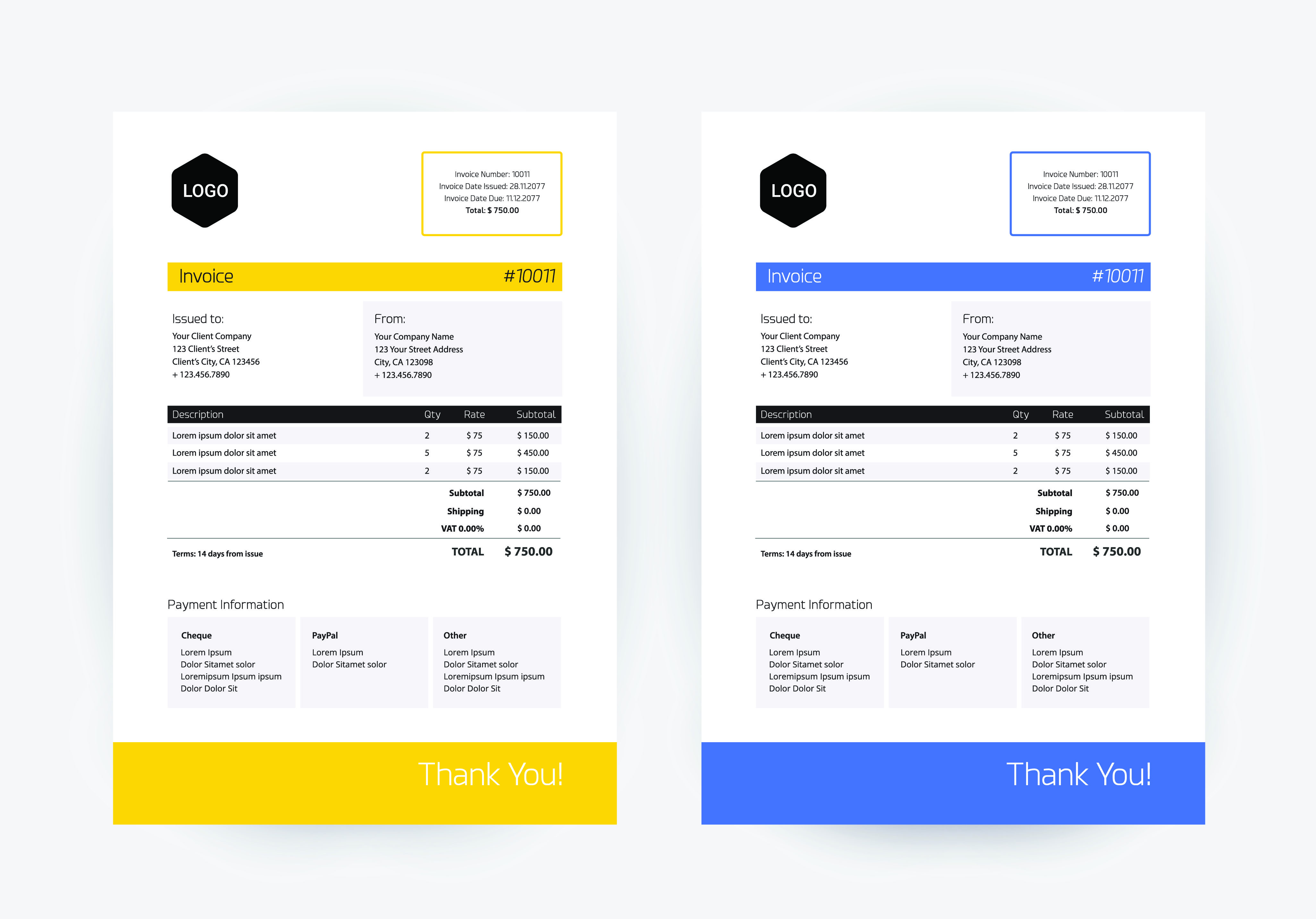
Another element to consider when designing your collections letter is the flow of content and overall structure. In what is sometimes called establishing a visual hierarchy or inverted-pyramid style writing, the most important information should be mentioned first and at the top of the letter.
In addition to stating the purpose of the letter right at the top, use design elements such as a bold title or highlighted text to make sure that text stands out. Take advantage of visual hierarchy by making use of white space to draw the reader’s eye to your content.
After explicitly outlining the intent of your collections letter, get into the secondary and tertiary details of the payment you’re requesting. This section should include an itemized list of the goods or services that need to be paid for, the total sum and due date (using those visual hierarchy points to emphasize that payment is due), and any additional information about the bill itself. This would be the place to include all the information you need to stay in compliance with invoicing laws.
Use Charts or Tables to Explain Payment Options

If you want to elicit a stronger consumer response, in the final section of your letter (this will likely be the lower third or quarter of the page), make sure to explain all of the ways your debtor can make a payment. By dedicating the bottom portion of your collection letter design to payment options, you close your statement with a call-to-action that is easy to understand.
Sending a check via mail, paying over the phone, and using a PayPal link are all options that can be included in this section. You might also consider inserting a QR code that sends the reader directly to a PayPal link or to their online patient portal or account.
If your company offers multiple payment methods or payment plans, outlining all of these options in one letter could overwhelm and confuse readers if presented in a paragraph format. One strategy for avoiding reader fatigue is placing this information in a chart or table, which will visually categorize payment options for your reader. If a chart is not an option, consider using bullet points or small paragraphs with clear titles to communicate payment options. In the event that your payment plans are too complex for a small table, consider including a second page in your letter that explains payment plan options in more detail.
Good Collection Letter Design Helps Debtors and Collectors Alike
There are many ways to make your collection letter design the best it can be without sacrificing compliance or clarity. Other formatting tips include making sure your writing is as concise as possible, including an itemized list of the bills to be paid, and keeping paragraphs as short as possible. In terms of design, you can explore elements such as font style and envelope color or layout.
With a strong and visually appealing collections letter, your company can facilitate faster payments, save time by avoiding delayed payments and late notices, and leave less to chance with your debt collection process. After all, a quick and easy transaction is part of a good customer service experience.
MailMyStatements is a technology-driven statement and payment vendor dedicated to simplifying the medical billing process for patient and practice. Our HITRUST-protected solutions create better relationships with patients while increasing revenue for providers. Start a conversation today and learn how to start with our easy onboarding process.
LEARN MORE ABOUT HOW OUR SOLUTIONS CAN SAVE YOU TIME AND MONEY!
![]()


