How a Poor User Experience Can Delay Your Medical Billing Cycle

Web design has never been more important in attracting and retaining customers. In 2017, 75% of digital and marketing professionals reported investing in design as a strategy to differentiate their brand from the competition. Given that a typical website user will form an opinion about a site in 50 milliseconds (and 75% of users make judgments about a brand’s legitimacy based on their web design), ensuring that your user interface (UI) design is up-to-date and follows the latest industry standards can help your business stay competitive.
UI design also plays a vital role within the accounts receivable industry. Clear, action-oriented web design can encourage customers to pay their bills in a timely fashion. Likewise, a negative online experience can work to your company’s detriment. When customers don’t understand how to pay their medical bills online, they are more likely to step away from their computer and forget to complete the process.
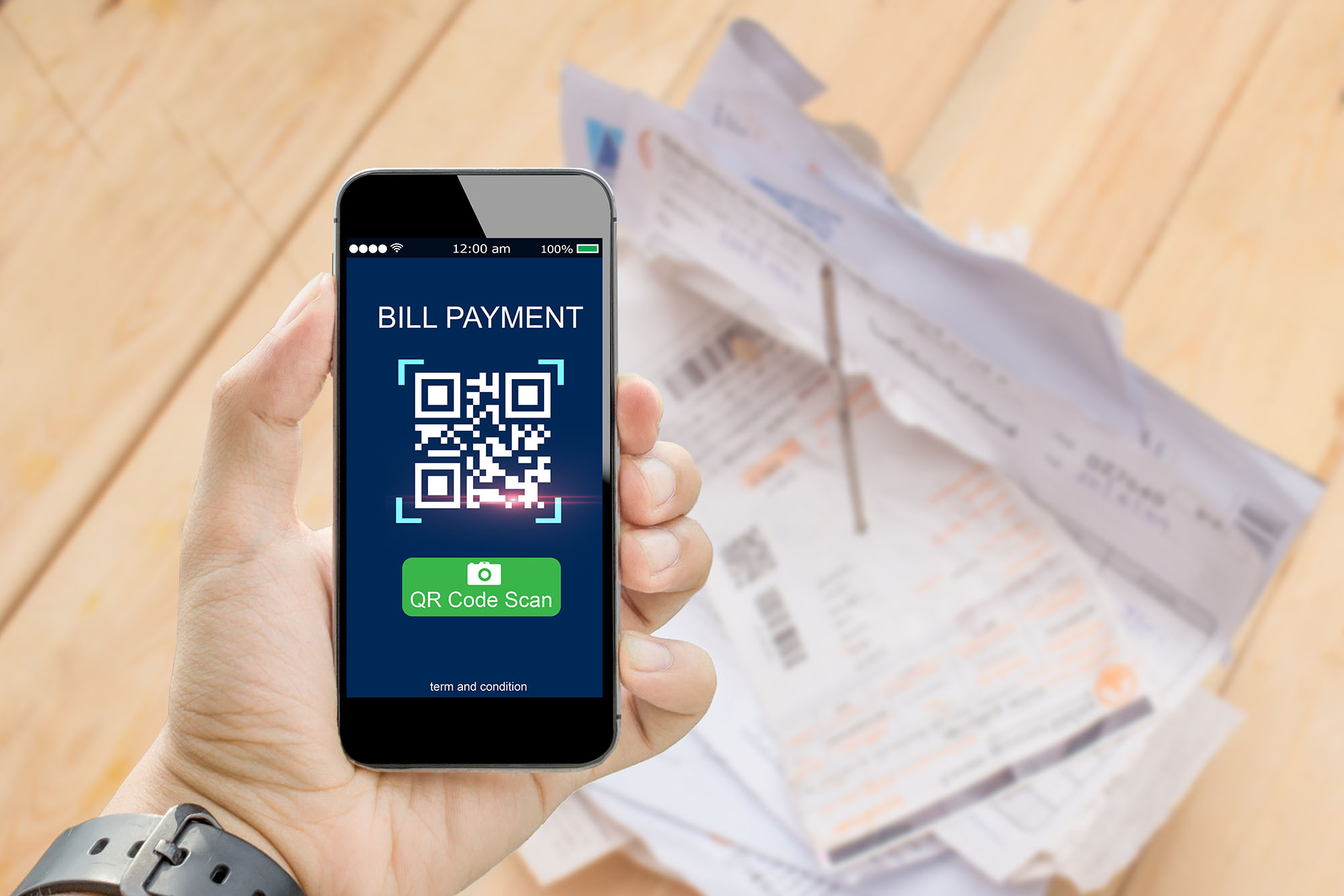
Although your customers can always call your company’s support services, those staff members shouldn’t be bogged down with guiding patients through an unnecessarily complicated website. And after all, what’s the point of offering QR code payment options, text-to-pay, and an online payment portal if your clients can’t access or understand these tools due to poor website layout?
Tight website design can influence a tighter medical billing revenue collection cycle for your company. Below are some common mistakes brands make with UI. Because these design elements could negatively affect your company’s bottom line, it’s crucial to work with a medical billing solution that can easily integrate its features into your existing platform.
4 Website Design Mistakes that can Delay Revenue Collection
1. A busy and confusing layout

A complicated layout can confuse your clients and erode trust in your payment portal. If your site doesn’t appear clean, crisp, and action-oriented, your clients will second guess whether or not they’re on the correct page. Buttons in unnatural places, unclear text, and unnecessary repeating elements can further confuse your customers about where to click next.
Many layouts look cluttered because of excess text on the page. Bulky text with irrelevant information will cause distractions and further sow doubt in your customers that they’re on the right webpage. They might navigate away from your page out of confusion or concern over clicking a false link, or they could get distracted and click away. Customers who head to your website to pay a bill are only looking to do just that—there’s no need to overwhelm your users with excess information, especially not on your payment portal.
“Noisy design” can be easily avoided by leaving plenty of white space between elements of your site. Stick to simple artwork, a minimal amount of text, and a pre-set number of fonts and colors to encourage a fast and easy payment.
2. Lack of consistency
Too many colors, fonts, text sizes, and other design elements can damage the look and feel of your payment portal. When these elements aren’t consistent with your brand colors, your customers will second guess the legitimacy of your site. They will look for a recognizable site with familiar colors and fonts. If your payment portal looks like a foreign site that isn’t associated with your brand, your users will expend extra mental energy trying to determine if they can trust your site.
In addition to staying consistent with your company’s brand, make sure your site is also consistent within itself. Do all the “pay now” buttons look the same, or do they have different fonts and colors that make them look like they go to different pages? And what about your form fields—do they repeat unnecessarily or look outdated compared to the rest of your site? Make sure to eliminate inconsistencies to quickly direct your customers toward paying their bills.
3. Smartphone compatibility
Did you know that nearly 80% of website traffic comes from mobile phones? Web pages that aren’t smartphone-compatible can damage a user’s experience with your company, with elements like horizontal scrolling and tiny text forcing people to slow down and search for the button they want. Particularly if your practice offers QR codes and text-to-pay functions, your users will expect a smooth website layout on their mobile phone.
Another important role that mobile compatibility can play in the user experience you offer is searchability. Google gives higher ratings to websites that are mobile-friendly, which means your customers search for your business or payment portal online, your page will appear higher up than your competitors without smartphone compatibility.
4. Delays and a Disjointed Experience
When it comes to waiting for websites to load, it’s no secret that humans are impatient: up to 47% of internet users expect a website to load in two seconds or less. The more redirects, loading time, and clicks your clients have to make, the more impatient they’ll get.
Users who have to navigate away from your website to a different domain could get bored and exit out of the payment process altogether. Additionally, if your payment portal involves redirecting away from your original site, customers will be wary of what they’re clicking on—especially because they’ll be entering their credit card information to pay their bill.
To avoid customer skepticism and impatience, be sure to minimize the number of new windows that your site opens, the number of page redirects, and your site’s overall load time. Development teams should also consider integrating your company’s payment portal and other features into your existing site for a smooth, straightforward user experience.
Create a Seamless Medical Billing Experience with the MailMyStatement Partnership Program

Maintaining a positive relationship between your customers and your brand requires keeping a watchful eye on the complete user experience your company offers, from how you deliver customer support to how your website functions.
MailMyStatements offers a partnership program to ensure a smooth bill payment process for your clients from start to finish. Through the MailMyStatements partnership program, partners can integrate medical billing solutions into the software you already use to create a quick and seamless bill payment process for your customers. Our partners also receive access to our new and improved EasyAdmin portal, through which the entire statement and payment system can be managed from any location with internet. Our portal is expertly designed to simplify the experience for our clients and their patients.
As a development, software, or private-label partner, MailMyStatements’ Application Programming Interface (API) integrations allow integrators to manage files and deliver data, handle e-statement subscriptions, and set up payment automation services. Partners can also work with the MailMyStatements development team to build custom APIs that meet the needs of clients and optimize partner integration. And, as a HITRUST-certified billing platform, your customers can rest assured knowing PHI, credit card information, and other sensitive data is secure.
![]()
Related Posts

How Inflation Is Changing Patient Payment Behavior
Inflation has moved well beyond the grocery aisle and the gas station, finding its next…

Healthcare Billing Audits: A Secret Weapon for CFOs
As a CFO or other finance professional, you will most likely reserve a healthcare billing…

16 Healthcare Revenue Cycle Management KPIs
While clinical outcomes drive success for healthcare providers, financial performance still plays a vital role…